

What 8 interviews taught me about check-in forms
The Check In App started with 8 interviews about waiting rooms and health forms. Here's how I ran them and what they changed.
Understand what frustrates people about clinic check-in before designing anything
The questions made sense. Their purpose didn't.
The project started as the portfolio prompt for my Google UX Design Certificate: design an app and a responsive website that let patients check in at their family doctor's office and answer health screening questions.
I covered how I planned the research in my planning Log: who to talk to, five pain points to test, and a script built on real moments. Here's how it went.
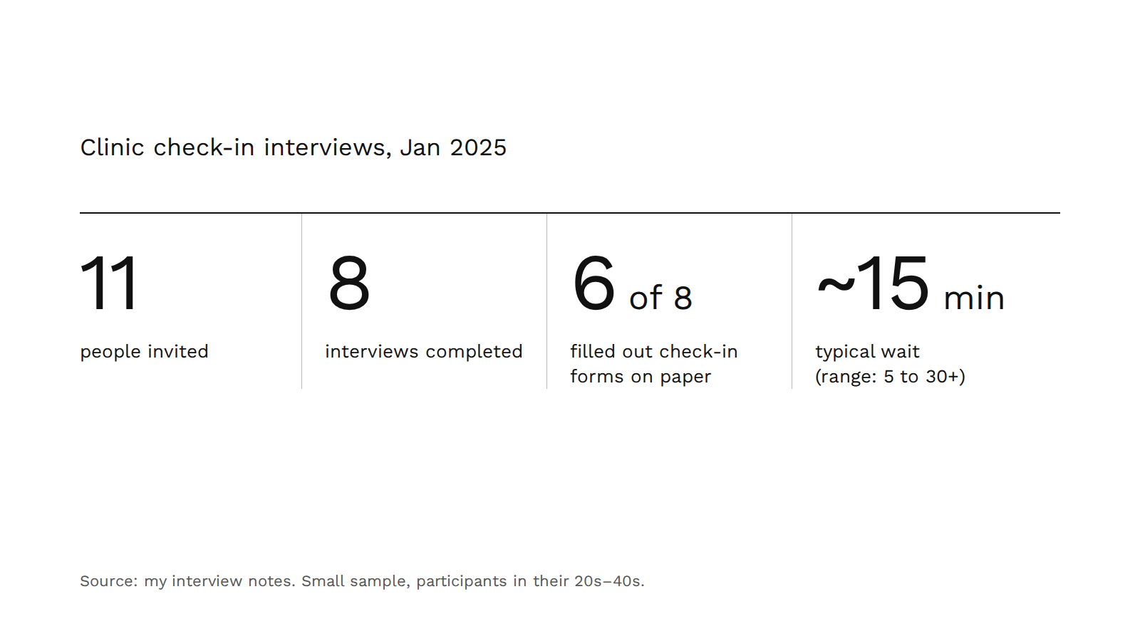
I invited 11 people and completed 8 interviews, with participants from their 20s to their 40s. Then I sat down to synthesize. A few patterns came through:
- Most waits ran about 15 minutes, with a range from 5 to over 30, and longer on a first visit because of new-patient paperwork. People described feeling uncomfortable around other sick patients, and staying on alert so they wouldn't miss their name.
- 6 of 8 filled out forms on paper.
- Insurance didn't change much. The experience was similar with or without it.
- The questions made sense. Their purpose didn't. People answered uncomfortable questions anyway, but wanted to know why they were asked, and why they were asked again in the exam room.
- Family history drew the most questions. People didn't see why it mattered for the visit they were there for. That led to a principle I wrote in my notes: if you're coming in for something that doesn't need the question, you shouldn't have to answer it.
What worked
- Asking about real moments. "Think of a time..." got concrete stories instead of general opinions.
- Testing the script first. A second pair of eyes on the questions before any real participant saw them.
- Synthesis changed the problem. I went in to make the form faster and came out needing to make it make sense.
What didn't
- The prompt was too broad. Partway through, I realized my questions needed a sharper focus on what I was trying to learn.
- My sample skewed young. 6 of 8 participants were in their 30s. That gap cost me a persona, which I wrote about separately.
- Not every question earned its place. Insurance turned out not to matter, so those questions took time without adding much.
The questions made sense. Their purpose didn't.
It would have been faster to jump into Figma. But the people who use a clinic check-in range from teenagers to retirees, and many are already unwell when they walk in. I didn't want to design for an imagined patient.
Talking to 8 real people turned a vague brief into a specific problem. Everything I've built since, including the version I'm now making with Claude, traces back to these interviews.